Komponenter
FileUpload
FileUpload består av et sett med delkomponenter relatert til filopplasting.
Egnet til:
- La brukere laste opp én eller flere filer.
- Vise status for opplasting: laster opp, feil, laster ned osv.
- La brukere dra og slippe filer.
- Vise liste med vedlegg.
Uegnet til:
- Forhåndsvisning av filer (vise miniatyrbilder).
- Validering og virussjekk av filer (må gjøres backend).
Eksempler
Delkomponenter
FileUpload.Dropzone er en komponent for opplasting av filer. Brukeren får et område/boks der de enten kan dra og slippe filer, eller klikke for å åpne filutforskeren.
FileUpload.Trigger er en wrapper som kan legges rundt en Button for å lage en helt enkel filopplastingsknapp som bare åpner filutforskeren.
FileUpload.Item brukes til å representere en fil. Den kan brukes både når man velger filer i en filopplaster, når filer lastes opp og til å vise tidligere opplastede filer. Den kan vise knapper for å slette og prøve på nytt.
Retningslinjer
Label og beskrivelse
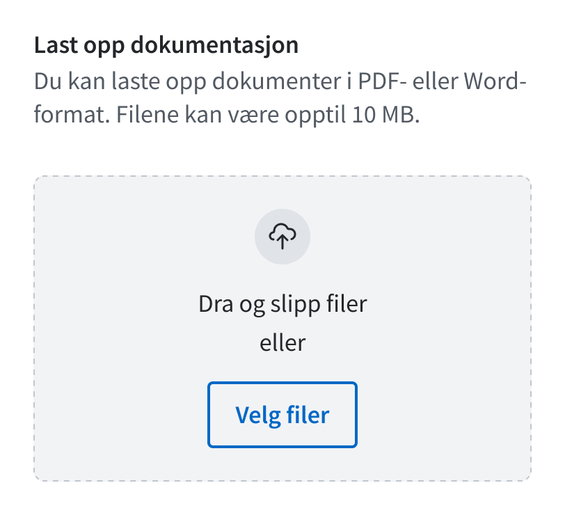
Label på Dropzone/Trigger bør starte med "Last opp", f.eks. "Last opp dokumentasjon". Unngå labeltekst som går over to linjer.
Beskriv hva slags filer som kan lastes opp. Skriv hver begrensning i separate setninger og bruk positiv formulering. Eksempler:
- Du kan laste opp dokumenter i PDF- eller Word-format.
- Filer kan være opptil 10 MB.
- Du kan legge ved opptil 5 filer.
Feilmeldinger
Både Dropzone og Item har støtte for å vise feilmeldinger, men det er ikke likegyldig hvilke feilmeldinger som vises hvor. Hovedregelen er at feilmeldingen skal vises der feilen kan fikses:
Dropzone
Skal vise feilmeldinger om at bruker ikke har lagt ved filer, eller for få filer. Feil med filer som allerede er lagt til skal ikke vises her, men på hver enkelt fil.
Item
Skal vise feil på enkeltfiler, for eksempel for stor, feil format osv. Filer med permanente feil (ikke feil ved opplasting) bør vises i en separat liste.
Feilmeldinger om for mange filer bør vises i en egen Alert over listen med filer.
ErrorSummary
Ved bruk av ErrorSummary bør feil med flere filer oppsummeres i ett punkt, med lenke til knappen på den første filen med feil. Hvis alle feilede filer er samlet under én overskrift, kan dere eventuelt lenke til den overskriften.
Fil-lister
Lister over filer bør lages med <ul> og <li>. Se eksempler.
Validering
Dropzone har innebygget støtte for å validere filstørrelse og filtype. Hvis du definerer filtyper, vil filutforskeren kun la bruker velge blant disse typene, men det vil fortsatt være mulig å dra-og-slippe andre filer.
Du kan også sende inn din egen validator-funksjon for egen valideringslogikk:
<FileUpload.Dropzone  label="Last opp filer"  onSelect={(files, { accepted, rejected }) => {    console.log(rejected);  }}  validator={(file: File) => {    if (list.includes(file.name)) {      return "Filen eksisterer allerede";    }    return true;  }}/>
// console[ { "file": ..., "reasons": [ "Filen eksisterer allerede" ] }]Husk at du ikke kan stole på klientsidevalidering. Format og størrelse bør dobbeltsjekkes på serversiden. Det bør også kjøres virussjekk. For bilder er det en fordel å sjekke kvaliteten hvis mulig.
Props
FileUpload
translations?
- Type:
RecursivePartial<{ dropzone: { button: string; buttonMultiple: string; dragAndDrop: string; dragAndDropMultiple: string; drop: string; or: string; disabled: string; disabledFilelimit: string; }; item: { retryButtonTitle: string; deleteButtonTitle: string; uploading: string; downloading: string; }; }> - Description:
i18n-API for customizing texts and labels
className?
- Type:
string
data-color?
- Type:
(string & {}) | AkselColor
ref?
- Type:
LegacyRef<HTMLDivElement> - Description:
Allows getting a ref to the component instance. Once the component unmounts, React will set
ref.currenttonull(or call the ref withnullif you passed a callback ref). React Docs
FileUpload.Dropzone
label
- Type:
string - Description:
Text shown to the user.
icon?
- Type:
ComponentType<any> - Default:
CloudUpIcon
translations?
- Type:
RecursivePartial<{ button: string; buttonMultiple: string; dragAndDrop: string; dragAndDropMultiple: string; drop: string; or: string; disabled: string; disabledFilelimit: string; }> - Description:
i18n-API for customizing texts and labels
multiple?
- Type:
boolean - Default:
true - Description:
Indicates if it is possible to select multiple files at once.
accept?
- Type:
string - Description:
Indicates which file types to accept. @see https://developer.mozilla.org/en-US/docs/Web/HTML/Element/input/file#accept
maxSizeInBytes?
- Type:
number - Description:
Maximum size of a file to accept
validator?
- Type:
((file: File) => string | true) - Description:
Custom validator that is used to decide if a file is accepted or rejected.
onSelect
- Type:
(files: FileObject[], partitionedFiles: FilesPartitioned) => void - Description:
Callback triggered on file select
fileLimit?
- Type:
{ max: number; current: number; } - Description:
Disables the dropzone when current >= max, unless
disabledprop is set tofalse.
error?
- Type:
ReactNode - Description:
Error message.
errorId?
- Type:
string - Description:
Override internal errorId.
disabled?
- Type:
boolean - Description:
Avoid using if possible for accessibility purposes.
Disables element.
description?
- Type:
ReactNode - Description:
Adds a description to extend the labeling.
id?
- Type:
string - Description:
Override internal id.
className?
- Type:
string
data-color?
- Type:
(string & {}) | AkselColor
ref?
- Type:
LegacyRef<HTMLInputElement> - Description:
Allows getting a ref to the component instance. Once the component unmounts, React will set
ref.currenttonull(or call the ref withnullif you passed a callback ref). React Docs
FileUpload.Item
as?
- Type:
(("div" | "li") & ElementType<any, keyof IntrinsicElements>) - Default:
"div" - Description:
Overrides html-tag
file
- Type:
FileItem - Description:
Either a native File or file metadata.
onFileClick?
- Type:
((event: MouseEvent<HTMLAnchorElement, MouseEvent>) => void) - Description:
onClick on the file name.
If neither this nor
hrefis set, and thefileprop is a native file, onClick will download the file.
href?
- Type:
string - Description:
href on the file name.
If neither this nor
onFileClickis set, and thefileprop is a native file, onClick will download the file.
error?
- Type:
string - Description:
Error message relating to the item.
status?
- Type:
"downloading" | "uploading" | "idle" - Default:
"idle" - Description:
Status "downloading" and "uploading" displays a loading indicator.
description?
- Type:
string - Description:
File description. Replaces file size when status is "idle". This is useful for displaying upload date. Should not act as a replacement for error messages.
button?
- Type:
{ action: "delete" | "retry"; onClick: (event: MouseEvent<HTMLButtonElement, MouseEvent>) => void; id?: string; } | ReactNode - Description:
Props for the action button.
translations?
- Type:
RecursivePartial<{ retryButtonTitle: string; deleteButtonTitle: string; uploading: string; downloading: string; }> - Description:
i18n-API for customizing texts and labels
className?
- Type:
string
data-color?
- Type:
(string & {}) | AkselColor
ref?
- Type:
LegacyRef<HTMLDivElement> - Description:
Allows getting a ref to the component instance. Once the component unmounts, React will set
ref.currenttonull(or call the ref withnullif you passed a callback ref). React Docs
FileUpload.Trigger
multiple?
- Type:
boolean - Default:
true - Description:
Indicates if it is possible to select multiple files at once.
accept?
- Type:
string - Description:
Indicates which file types to accept. @see https://developer.mozilla.org/en-US/docs/Web/HTML/Element/input/file#accept
maxSizeInBytes?
- Type:
number - Description:
Maximum size of a file to accept
validator?
- Type:
((file: File) => string | true) - Description:
Custom validator that is used to decide if a file is accepted or rejected.
onSelect
- Type:
(files: FileObject[], partitionedFiles: FilesPartitioned) => void - Description:
Callback triggered on file select
ref?
- Type:
LegacyRef<HTMLInputElement> - Description:
Allows getting a ref to the component instance. Once the component unmounts, React will set
ref.currenttonull(or call the ref withnullif you passed a callback ref). React Docs